Q&A: PFW Illustrator Jiajia Li
Before fashion film, there was fashion photography, and before fashion photography, there was fashion illustration. Dazzling the pages of many of fashion's most revered publications, wondrous illustrations adorned the covers (and continued to decorate the inside pages) of Vogue, Harper's Bazaar, Flair, Tatler and many more throughout the first half of the 20th century, proving quite an asset to the quintessential style bible. Having always believed in the power of illustration, primarily when used to communicate a mood or palpable presence, SHOWstudio have long been inviting fashion's most talented illustrators, on and under the radar, to offer their unique talent in interpreting the latest season's collections.
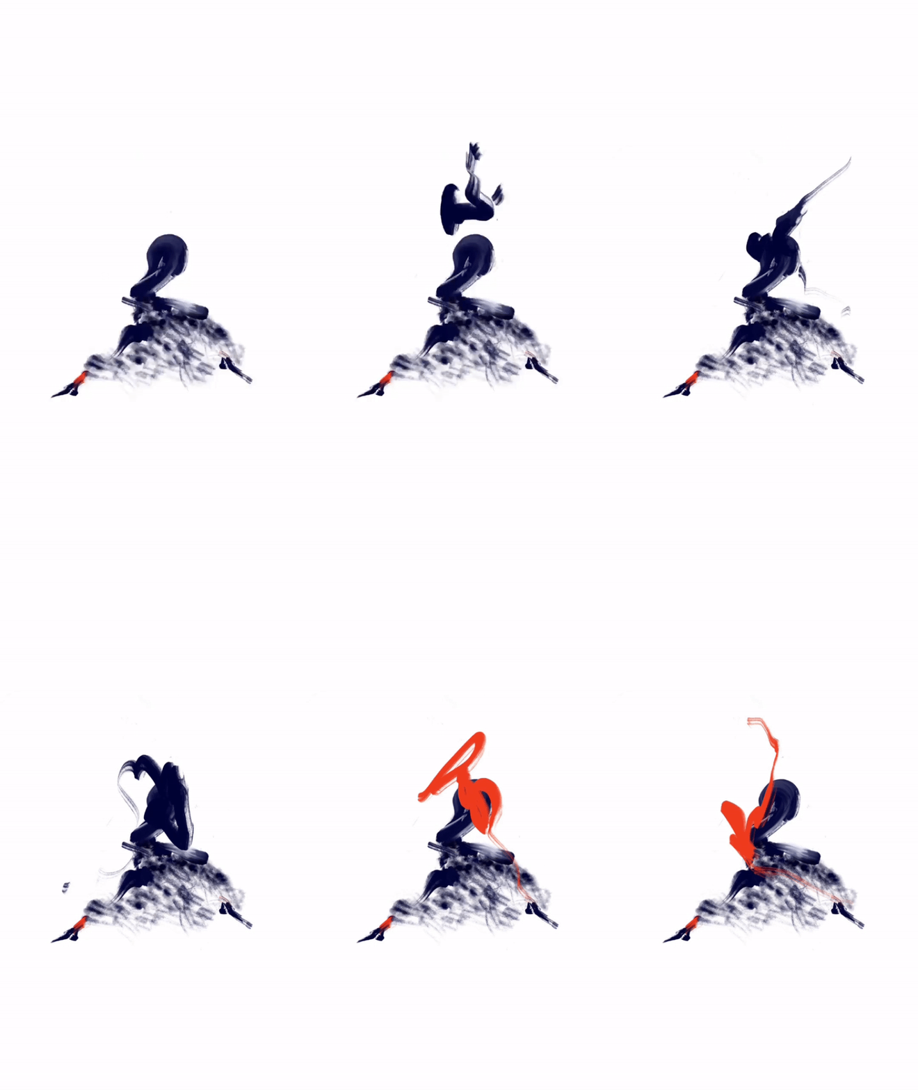
Paris collections are always a flurry of activity, often lasting over a week, whether presentations are happening digitally or in-person. For the A/W 22 season, SHOWstudio and Nick Knight commissioned illustrator Jiajia Li to capture and interpret this energy. The resulting series of a digital paintings and animations convey the dynamism of the dressed body: arms sweep over folds of fabric and legs emerge akimbo from vibrant drapes of cloth.
Taking inspiration from the atmosphere of each brand's presentation, emotion and intuition guide Li's hand in creating vivid and abstract illustrations, getting to the heart of what makes fashion resonate so deeply within us. Over email, Li discussed process, minimalism, and the evolution of her style with SHOWstudio's Cyana Madsen.
View Li's illustrations in full here.
Cyana Madsen: How would you describe your illustrative style in three words?
Jiajia Li: Abstract, artistic, decorative.
CM: In your animated illustrations, the focus is often on the limbs rather than the full figure, can you tell us more about that?
JL: It is actually coming from my drawing process. While listening to the fashion shows, I always start with drawing multiple random limbs with what I have felt from the rhythm and what my emotion leads me towards. Then I choose what perspectives are my favourites. Some limbs are themselves powerful enough to express emotions, so I would leave them just the way they are and see if they should be animated to let my audience better understand my motive.
CM: Your static illustrations also feel very kinetic. Is representing the garments in motion central to your practice?
JL: YES, dynamic in stillness is what I want. In fact, showing the mobility of the fabric is not my main purpose. The clothes are static, but when worn on a person's body they will have a different look from different angles. What I want to capture is the moment I saw the clothes in the show, what it triggered in me.
CM: What about digital illustration excites you?
JL: The co-existence of uncertainty and controllability. Each of my paintings starts out wild, the base of each painting is just a brushstroke, it is just a vehicle for my pure emotion. But such wildness is often too abstract, and it may be so blurred that I can no longer feel the emotion at that time. It is only then that I build up a character through observation. Such a process requires thought and deliberation, and the changeability of digital drawings gives me a lot of space.
CM: Have you worked with other mediums in your illustration work?
JL: In fact, I started to paint a lot of digital paintings in the last two years, before that I had tried various painting media, acrylic, pen, pencil, watercolour, ink... In the future I am looking forward to going back to traditional painting or a combination of both.
CM: You work with a wide palette of colour, anchored with strokes of strong black or navy. Is that a conscious choice?
JL: Yes, my paintings mainly come from two creative steps, the brushstrokes as the base and the costumes decorated on the brushstrokes. The colour choice for the brush strokes is usually dark because that way I can feel the sense of power and the strong emotion I want to put across. The colours of the costumes first come from the garments that inspire me, and then serve to harmonize the whole.
CM: What feelings do you want to evoke in the viewer when they look at your illustrations?
JL: I only want the people who see my paintings to feel the emotional swings, whether they feel the same emotions as I do is not my focus. Everyone can have a different interpretation.
CM: Do you feel that fashion illustration conveys something about clothing that photo or video cannot?
JL: Yes, the painting is loaded with a lot of the painter's own emotions, observations and understandings. Often the painting made under such conditions is a work of art in itself.
CM: Are there other illustrators you look up to? Dead or alive?
JL: Henri Mattise and Yoshitomo Nara. Henri Mattise's 'Blue Nudes' and 'The Dance II' and Yoshitomo Nara's 'Midnight Truth'. They all have one element in their paintings that is most important to me, purity. The simplest of Henri Matisse's depictions of the human body, the movement and power given to it in its stillness, was the initial inspiration for me to create my abstract figure drawings; the eyes of the child in Yoshimoto Nara's painting have the deepest turbulence beneath a rippling sea, a quiet power that I hope to express in my paintings in the future. In the future, I may try to deepen the gaze and communication of the eyes, in addition to expressing movement with the body.
CM: What elements outside of fashion inspire your practice?
JL: Modern dance, jazz, hip hop, blues songs, photography and a sip of whiskey.


